The post is in Korean. If you have difficulty in Korean, please click on a globe located top of the site to translate it into your language:
필요 패키지
install.packages("devtools")
devtools::install_github("ropensci/rnaturalearthhires")
install.packages("ggplot2")
install.packages("maps")
install.packages("mapdata")
install.packages("mapproj")
install.packages("rnaturalearth")
install.packages("rnaturalearthdata")
install.packages("sf")

library(ggplot2)
library(maps)
library(mapdata)
library(mapproj)
library(rnaturalearth)
library(dplyr)
library(rnaturalearthdata)
library(sf)

## 일본 지도 데이터 다운로드
install.packages("remotes")
remotes::install_github("uribo/jpndistrict")
library(jpndistrict)
지도를 간단하게 표시하기
## 일본 전도를 표시
map(regions = "japan", interior = TRUE, lty = 1)
box()

## 일본 전도를 행정구역 단위까지 표시, 그러나 map 패키지 데이터베이스에 저장되어 있는 지도 데이터만 사용 가능
map("japan", interior = TRUE, lty = 1)
box()

 ## 일본의 특정 위도와 경도를 표시
map("japan", xlim = c(131, 137), ylim = c(33, 36))
box()
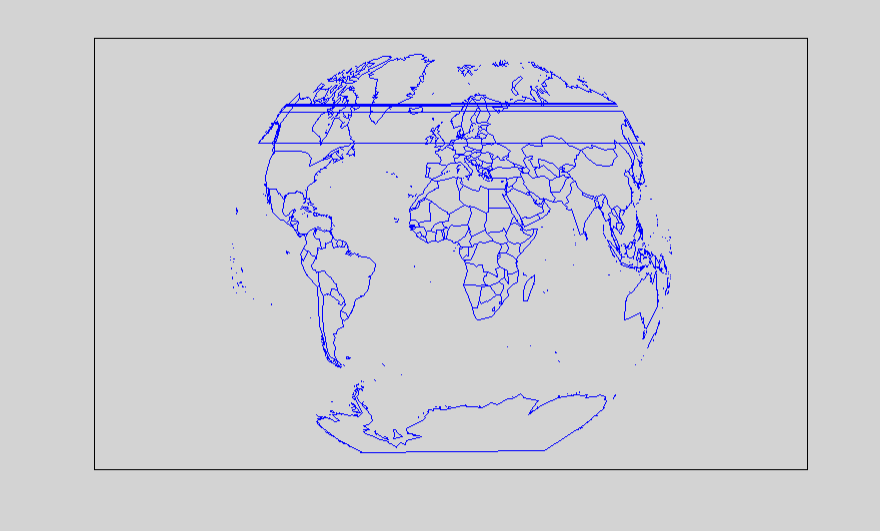
## 메르카토르법으로 세계지도 표시
map("world", projection = "mercator", col = "blue", bg = "lightgrey")
box()

## 길버트법으로 세계지도 표시
map("world", projection = "gilbert", col = "blue", bg = "lightgrey")
box()
지도에 지역구분까지 나타내기
## 한국전도를 표시
korea_admin <- ne_states(country = "South Korea", returnclass = "sf")
ggplot(korea_admin) +
  geom_sf(aes(fill = name), color = "black") +
  scale_fill_viridis_d(option = "C") +
  ggtitle("South Korea with Province Borders") +
  theme_minimal()

## 일본전도를 표시
Japan_admin <- ne_states(country = "Japan", returnclass = "sf")
ggplot(Japan_admin) +
  geom_sf(aes(fill = name), color = "black") +
  scale_fill_viridis_d(option = "C") +
  ggtitle("Japan with Province Borders") +
  theme_minimal()

## 일본 간사이지방을 표시
Japan_admin <- ne_states(country = "Japan", returnclass = "sf")
ggplot(Japan_admin) +
  geom_sf(aes(fill = name), color = "black") +
  scale_fill_viridis_d(option = "C") +
  ggtitle("Japan with Province Borders") +
  coord_sf(xlim = c(134, 136.5), ylim = c(33, 36.5)) +
  theme_minimal() +
  guides(fill = "none")


## 도쿄만 지도에 나타내기
tokyo_admin <- Japan_admin %>% filter(name == "Tokyo")
ggplot(tokyo_admin) +
  geom_sf(fill = "lightblue", color = "black") +
  ggtitle("Tokyo Map") +
  theme_minimal()

## 혼슈 섬의 도쿄만 지도에 나타내기
tokyo_admin <- Japan_admin %>% filter(name == "Tokyo")
ggplot(tokyo_admin) +
  geom_sf(fill = "lightblue", color = "black") +
  coord_sf(xlim = c(138.8, 140), ylim = c(35.4, 35.9)) +
  ggtitle("Tokyo Map") +
  theme_minimal()

각 지역의 행정구역까지 나타내기
## 지정된 위도와 경도의 도쿄 지도 나타내기
tokyo_admin <- jpn_pref(13)
ggplot(tokyo_admin) +
  geom_sf(fill = "lightblue", color = "black") +
  coord_sf(xlim = c(138.8, 140), ylim = c(35.4, 35.9)) +
  ggtitle("Tokyo Map") +
  theme_minimal()
지도에 위치 표시하기
## 신주쿠의 위치를 도쿄 지도에 나타내기
tokyo_admin <- jpn_pref(13)
shinjuku_coord <- data.frame(lon = 139.6995, lat = 35.6905)
ggplot(tokyo_admin) +
  geom_sf(fill = "lightblue", color = "black") +
  geom_point(data = shinjuku_coord, aes(x = lon, y = lat), color = "red", size = 3) +
  geom_text(data = shinjuku_coord, aes(x = lon, y = lat, label = "신주쿠"),
            color = "blue", size = 5, fontface = "bold", nudge_y = 0.015) +
  coord_sf(xlim = c(139.6, 139.95), ylim = c(35.5, 35.85)) +
  ggtitle("Tokyo Map") +
  theme_minimal()
실습: 미국 각 주별 1인당 GDP 나타내기
## 미국지도를 나타내기
USA_admin <- ne_states(country = "united states of america", returnclass = "sf")
ggplot(USA_admin) +
  geom_sf(aes(fill = name), color = "black") +
  scale_fill_viridis_d(option = "B") +
  ggtitle("GDP per capita for USA states") +
  theme_minimal()

### 지도 조정
USA_admin <- ne_states(country = "united states of america", returnclass = "sf")
ggplot(USA_admin) +
geom_sf(aes(fill = name), color = "black") +
scale_fill_viridis_d(option = "B") +
ggtitle("GDP per capita for USA states") +
theme_minimal() +
guides(fill = "none") +
coord_sf(xlim = c(-130, -65), ylim = c(20, 50)) +
theme(plot.title = element_text(hjust = 0.5))
## 알래스카
ggplot(USA_admin) +
geom_sf(aes(fill = name), color = "black") +
coord_sf(xlim = c(-170, -131), ylim = c(50, 72)) +
theme_minimal() +
guides(fill = "none")
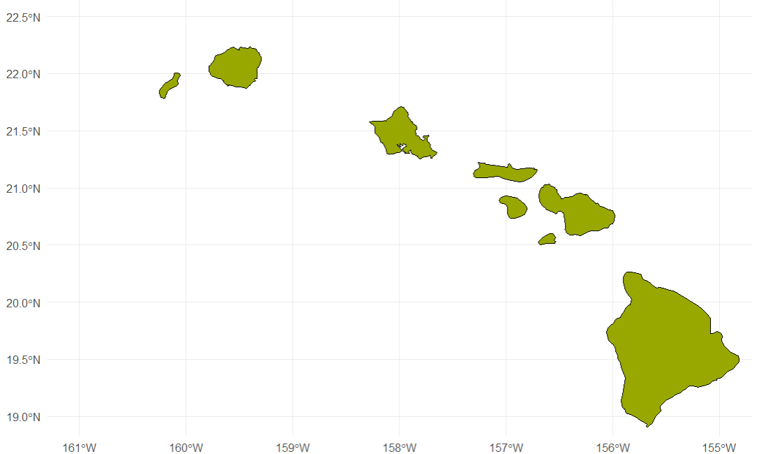
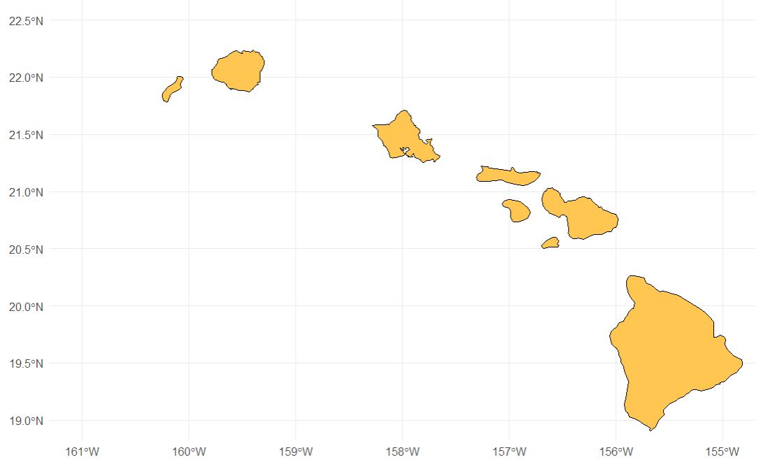
## 하와이
ggplot(USA_admin) +
geom_sf(aes(fill = name), color = "black") +
coord_sf(xlim = c(-161, -155), ylim = c(19, 22.5)) +
theme_minimal() +
guides(fill = "none")

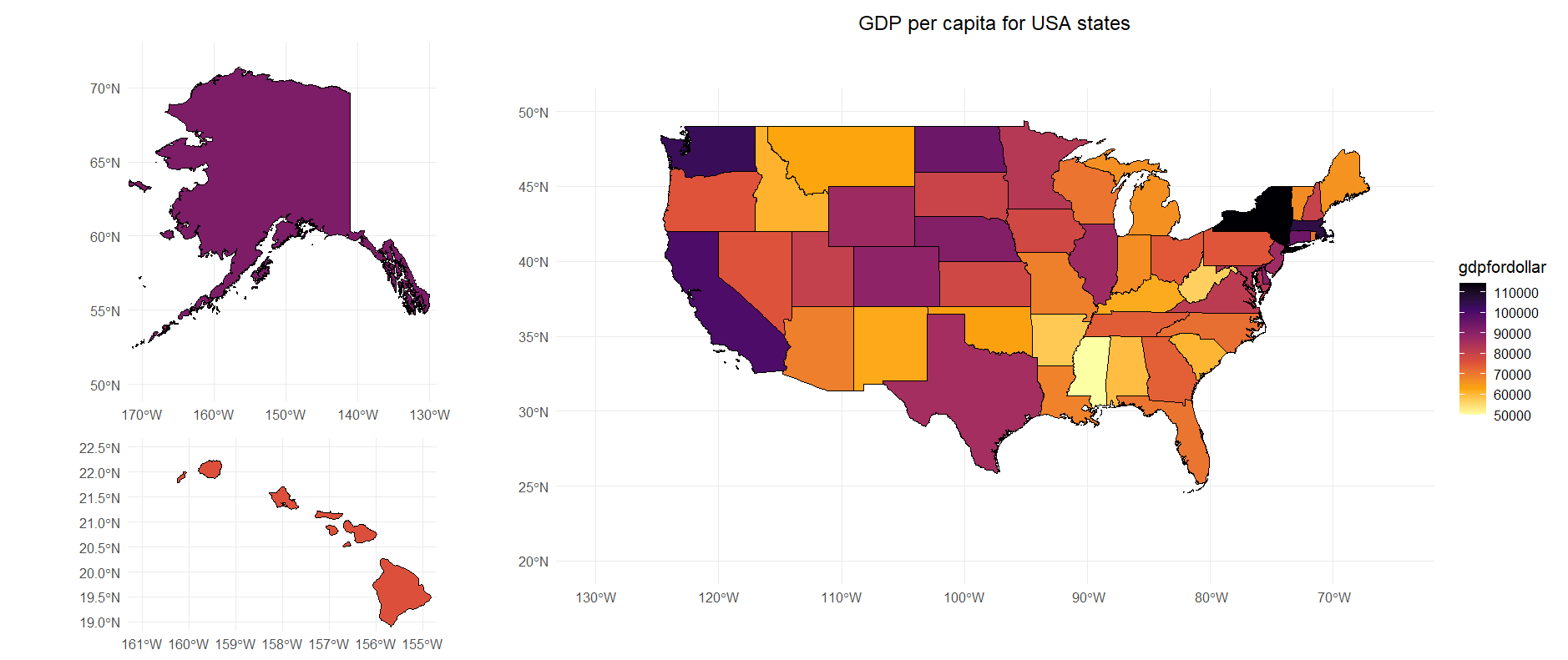
## 1인당 GDP 데이터 추가
state_gdp <- read.csv("D:/학습/states_gdp.txt", sep = ",", header = TRUE)
state_gdp

state_gdp <- read.csv("D:/학습/states_gdp.txt", sep = ",", header = TRUE)
state_gdp

USA_admin <- ne_states(country = "united states of america", returnclass = "sf")
USA_admin <- USA_admin %>%
  left_join(state_gdp, by = "name")
ggplot(USA_admin) +
geom_sf(aes(fill = gdpfordollar), color = "black") +
ggtitle("GDP per capita for USA states") +
scale_fill_viridis_c(option = "B", direction = -1) +
theme_minimal() +
coord_sf(xlim = c(-130, -65), ylim = c(20, 50)) +
theme(plot.title = element_text(hjust = 0.5))
ggplot(USA_admin) +
geom_sf(aes(fill = gdpfordollar), color = "black") +
coord_sf(xlim = c(-170, -131), ylim = c(50, 72)) +
scale_fill_viridis_c(option = "B", direction = -1) +
theme_minimal() +
guides(fill = "none")
ggplot(USA_admin) +
geom_sf(aes(fill = gdpfordollar), color = "black") +
coord_sf(xlim = c(-161, -155), ylim = c(19, 22.5)) +
scale_fill_viridis_c(option = "B", direction = -1) +
theme_minimal() +
guides(fill = "none")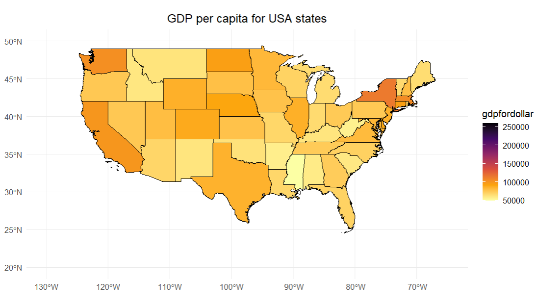

잠깐, 여기서 끝내고 싶지 않다... 왜냐하면 이상치 (1인당 GDP가 무려 25만 달러에 육박하는 컬럼비아 특구)가 있기 때문에, 이 지도 데이터로는 미국의 각 주별로 1인당 GDP차이를 명확히 알기 어렵다. 어차피 컬럼비아 특구의 크기는 지도에 잘 보이지 않을 만큼 작기 때문에, 컬럼비아 특구의 데이터를 중앙값인 $75000정도로 하고, 다시 지도로 표시하겠다.
install.packages("patchwork")
library(patchwork)

big_plot <- ggplot(USA_admin) +
  geom_sf(aes(fill = gdpfordollar), color = "black") +
  ggtitle("GDP per capita for USA states") +
  scale_fill_viridis_c(option = "B", direction = -1)  +
  theme_minimal() +
  coord_sf(xlim = c(-130, -65), ylim = c(20, 50)) +
  theme(plot.title = element_text(hjust = 0.5))

small_plot1 <- ggplot(USA_admin) +
  geom_sf(aes(fill = gdpfordollar), color = "black") +
  coord_sf(xlim = c(-170, -131), ylim = c(50, 72)) +
  scale_fill_viridis_c(option = "B", direction = -1)  +
  theme_minimal() +
  guides(fill = "none")

small_plot2 <- ggplot(USA_admin) +
  geom_sf(aes(fill = gdpfordollar), color = "black") +
  coord_sf(xlim = c(-161, -155), ylim = c(19, 22.5)) +
  scale_fill_viridis_c(option = "B", direction = -1)  +
  theme_minimal() +
  guides(fill = "none")

layout <- ((small_plot1 / small_plot2) | big_plot ) +
  plot_layout(widths = c(1, 2))

layout